Psychology of Colour
- Jan 27, 2017
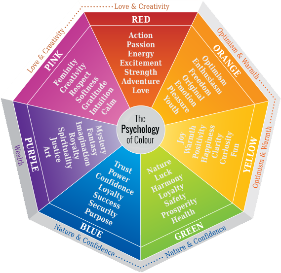
Psychology of Colour
Many decisions on painting a home are instinctive. Looking at the Psychology of Colour graphic below we can recognise colours associated with emotions. For example we may consider blue for a home office based on blue being associated with being productive or purposeful or successful or loyal.
Choosing Colours for a Rental Property or Busy Kids Room
 Some decisions like a colour for a rental property or busy kids room must take into account it's maintenance qualities. A colour with high opacity with colour strength that covers well will allow one coat when it comes to a minor repair. This will save money on maintenance.
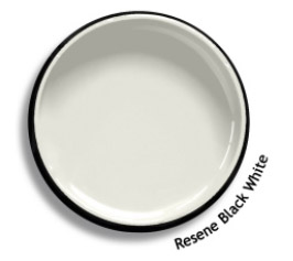
Blair often recommends Resene Black White when it comes to rental properties due to the factors mentioned above.
An experienced painter like Blair can give you an indication of the finsihed product.
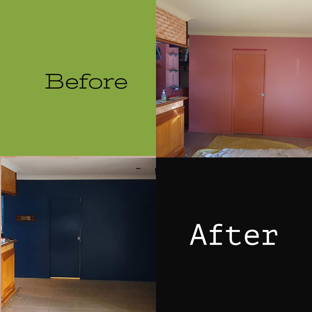
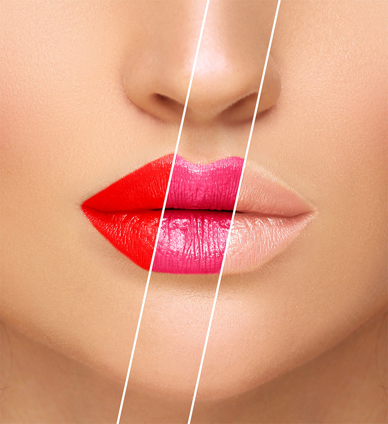
Before and After Colour Change
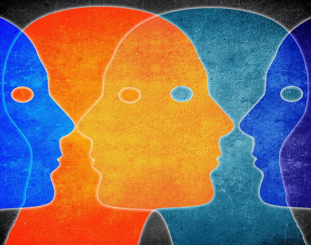
Colour can give an Emotional Response
"...while colour itself, the result of wavelength of photons, may be (relatively) simple, our ability to perceive it is anything but. It's down to complex systems in our brains, ones that evolved and develped over millions of years. This means there's ample scope for the neurological mechanisms of colour perception to be intertwined with the brain's emotional systems."
"...Vision is the dominant human sense. Some estimates suggest 80 to 85 of our perception, learning, thinking, and general brain activities are mediated through vision in some way. So the idea that seeing certain colours would trigger an emotional response isn't such a stretch."
Universal Colours
A universal colour is one that if you were choosing clothes would look good on anyone. The fashion industry has known this secret for some time.
Universal colors are:
- Neither very warm or cool in COLOUR TEMPERATURE.
- Between medium light and medium dark in COLOUR DEPTH/VALUE
- Are neither obviously bright & clear or dull and grayed in INTENSITY (chroma or saturation).
Colour Examples
- Teal
- Soft White
- Charcoal
Orange is a colour that a 'cool' person could never wear. Often people have a preference for cool or warm colours. A universal colour would work with either person.
Are you aware of your own colour preferences?
Other Articles
Dec 6, 2024 How VOCs in Paint Affect Indoor Air Quality
Mar 17, 2023 Plantation Shutters with Shade Sails
Oct 31, 2022 The Path of the Sun
Sep 27, 2021 Timber Clear Coat Broken-down
Aug 20, 2021 Protecting your Floors when Painting
Sep 11, 2020 Door hinges should not be painted
May 25, 2020 Revitalising faded Colorbond Powdercoating
Mar 16, 2020 Painting your front door
Jan 16, 2020 How to Paint a Wall with a Roller
Sep 21, 2018 Repair Walls Gold Coast
Sep 3, 2018 Exterior Timber
Apr 24, 2017 Remodeling Your Home
Apr 7, 2017 Contemporary Design
Mar 17, 2017 House Painted at Southport
Nov 25, 2016 Before After Beach House Tugun
Nov 13, 2016 Dulux Wash and Wear
Oct 14, 2016 Consider the Light
Aug 8, 2016 Caution with exterior colours
Aug 25, 2015 Value for Money Painting Quotes
Aug 19, 2015 Award Winning Home
May 27, 2015 Green Non Toxic Painters Southport Gold Coast
Apr 16, 2015 Taubmans Certified Painter
Mar 21, 2015 Non Toxic paints
Mar 3, 2015 Colour Consulting Gold Coast
Apr 26, 2014 Care when using Whites
Apr 4, 2014 Re-Painting Timber Doors
Jan 18, 2014 Tilt Slab Duplex Before After
Dec 17, 2013 A change of colour
Jun 6, 2011 Dennis Beck Reference
May 14, 2011 Paintwork for busy areas
Apr 26, 2011 Standing the test of time
Feb 27, 2011 New Environmentally Friendly Paints
May 23, 2009 The Recession & pricing
Aug 9, 2008 Gold Coast Commercial Paintwork
Jan 20, 2007 Feature wall example